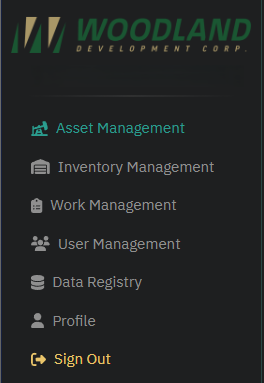
Understanding the Sidebar
The sidebar serves as the primary navigation menu for the website. It provides quick access to the core features and sections of the platform. Here’s an overview of its structure and functionality:
Location
- The sidebar is located on the left side of the screen and is visible throughout the platform, ensuring easy navigation between sections.
Minimizing the Sidebar
- At the bottom of the sidebar, you’ll find an arrow icon pointing left.

- Clicking this icon will minimize the sidebar, reducing it to a compact version that only shows icons for each section.
- This is useful for maximizing screen space while maintaining quick access to navigation.
Expanding the Sidebar
- Once minimized, the arrow icon will reappear, now pointing to the right.
- Clicking the icon again will expand the sidebar back to its full view, displaying both icons and text labels for all sections.
Components
User Information:
- Displays the logged-in user’s email address at the top for quick reference.
Navigation Links:
- Each item in the sidebar corresponds to a specific feature or section of the platform. These include:
- Asset Management: Manage and track facilities and assets.
- Inventory Management: Oversee and organize inventory items.
- Work Management: Manage workflows and assignments.
- User Management: Handle user accounts and permissions.
- Data Registry: Access and maintain data records.
- Profile: View and update personal account details.
- Each item in the sidebar corresponds to a specific feature or section of the platform. These include:
Sign Out:
- The Sign Out option at the bottom allows users to securely log out of the platform.
Icons
- Each link is accompanied by an icon for visual clarity, making it easier to locate specific sections at a glance.
Behavior
- The sidebar remains static, providing consistent navigation without the need to reload or scroll through pages.
Best Practices
- Use the sidebar to switch between sections instead of relying on browser navigation buttons.
Site Customization
The Interface Settings allow users to personalize their experience by adjusting the visual appearance of the website. This includes selecting color themes and enabling accessibility features.
Accessing Interface Settings
- Locate the Gear Icon in the top-right corner of the screen.

- Click the icon to open the Interface Settings menu.

Customization Options
Color Settings:
- Choose from a variety of preset color themes to customize the website’s appearance.
- Click on a color block to apply it instantly.
Contrast Layout:
- Enable Dark Mode: Switch the interface to a darker theme for better visibility in low-light environments.
- Enable High Contrast: Improve readability by enhancing the contrast between text and background elements.
Exiting the Menu
- Click the X icon in the top-right corner of the Interface Settings menu to close it.
Top Action Bar Features
1. Columns
- Purpose: Customize which columns are displayed in the table.
- How to Use:
- Click the Columns button.
- A dropdown menu will appear with a list of all available columns.
- Check or uncheck columns to display or hide them in the table.
- Use Case: Focus on the most relevant data while hiding unnecessary information to reduce clutter.
2. Filters
The Filters feature allows users to refine the data displayed in the table by applying specific criteria. This is particularly useful for narrowing down large datasets to focus on relevant information.
How to Use Filters
- Click the Filters button in the top action bar to open the filter menu.
- A filter panel will appear with the following options:
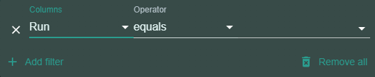
- Columns: Choose a column from the dropdown list (e.g., Facility Name, UWI, Run, Zone).
- Operator: Select the filtering condition. Common operators include:
- Contains
- Does Not Contain
- Equals
- Does Not Equal
- Starts With
- Ends With
- Is Empty
- Is Not Empty
- Is Any Of (Which is a multiple selection option)
- Is
- Is Not
- Value: Enter the value or criteria to filter by (e.g., specific Facility Name or Run value).
Filter Options
- Add Filter:
- Click the Add Filter button to apply additional filters (And/Or)
- Multiple filters can be used simultaneously, allowing for advanced filtering across multiple columns.
- Remove Filter:
- Click the X icon next to a filter to remove it.
- Remove All:
- Click the Remove All button to clear all active filters and display the full dataset.
Available Columns for Filtering
You can filter by any of the following columns:
Asset Management:
- ID
- Facility Name
- UWI
- Facility Type
- Cost Center
- Area
- Sub-Area
- Run
- Zone
- Maintenance Profile
- Maintenance Base Date
Inventory Management:
Placeholder
Work Management; Work orders:
- ID
- Facility
- Zone
- Type
- Priority
- Status
- Notes
- Start Date
- Due Date
Work Management; Scheduled Work orders:
- ID
- Facility
- Zone
- Type
- Notes
- Interval
- Create Target
- Start Date
- Enabled
User Management:
- ID
- First Name
- Last Name
- Phone Number
- Assigned Zones
- Schedule Tracking
Data Registry:
- Table Name
- Column Name
- Key Detail
- Metadata
- Notes
Practical Use Cases
- Filter by Zone to view facilities in a specific geographic area.
- Use the Run filter to narrow results to a specific operational run.
- Combine filters (e.g., filter by Facility Type and Cost Center) to refine data further.
3. Reset Widths
- Purpose: Reset the widths of all columns in the table to their default size.
- How to Use:
- Click the Reset Widths button.
- All custom width adjustments made to the columns will be undone, returning them to their original configuration.
- Use Case: Ideal for users who want to revert back to the standard table view after resizing columns.
4. Refresh
The Refresh button in the top action bar ensures that the table displays the most up-to-date information available. This is particularly important in collaborative environments where multiple users may be making changes simultaneously.
How It Works
- Clicking the Refresh button reloads the data in the table, ensuring that any recent changes (e.g., additions, edits, or deletions) made by you or others are reflected.
Out of Sync Notification
- If a change is made to the data while you are viewing the table (such as another user updating or adding entries), an “Out of Sync” notification will appear next to the Refresh button.

- This notification indicates that the data displayed in your table may no longer be accurate or complete.
Steps to Resolve
- When you see the “Out of Sync” notification, click the Refresh button to reload the table and sync it with the most current data.
- The notification will disappear once the data is refreshed.
Use Case
- This feature is particularly useful for teams working collaboratively, ensuring that all users have access to consistent and up-to-date information without having to leave the page or manually reload the site.
5. Search Bar
- Location: The Search Bar is located on the right-hand side of the top action bar.

- Purpose: This search bar is local to the current table. It allows users to quickly find specific entries or data within the currently displayed dataset.
How It Works
- Enter a keyword or phrase into the Search field.
- Press Enter or wait for the table to filter results automatically.
- The table will display rows that match your search criteria, looking across all visible columns.
Use Case
- Useful for quickly locating a specific facility, UWI, or data point when working with a large dataset.
- Unlike a global search, this search bar only applies to the current section or table.
Actions Column
In various sections of the site, such as Asset Management, an Actions column provides quick access to essential tools for managing data entries. These tools are represented by icons for ease of use.
Icons in the Actions Column

Quick Edit Tool (Pencil Icon):
- Clicking the Pencil Icon activates the quick edit mode for the corresponding entry.
- Once in quick edit mode:
- All editable fields in the row will be highlighted, indicating that they can be modified.
- The Pencil Icon will change to a Hard Disk Icon (Save Icon).
- After making changes, click the Save Icon to apply and save your edits.
- If you decide not to make any changes, simply click the X Icon (Cancel Icon) to exit the quick edit mode.
Delete Tool (Trash Icon):
- Clicking the Trash Icon activates a delete confirmation mode for the corresponding entry.
- In this mode:
- The Trash Icon changes to an X Icon (Cancel Icon), allowing you to cancel the delete action.
- Clicking the X Icon will exit the delete confirmation mode and revert the icon back to the Trash Icon.
- To proceed with deletion, confirm in the displayed prompt. Caution: Deleting an entry is permanent and cannot be undone.
Tips for Using the Actions Column
- Use the Quick Edit Tool for fast updates to specific fields without needing to open a full edit form.
- If unsure about a delete action, use the X Icon to cancel the operation safely.
- Be cautious when confirming deletions, as this action is irreversible.
Adjustable Column Widths:
- You can resize the width of each column by clicking and dragging the edges of the column headers.
- The new column widths will automatically save. This means your adjustments will persist even if you:
- Navigate to other pages.
- Close the platform and return later.
- This feature allows you to customize the table view to focus on the most important data for your needs.

Resetting Column Widths:
- If you wish to return the columns to their default widths, use the Reset Widths button at the top-right of the table.
- This action reverts all column sizes to their original configuration, clearing any adjustments you’ve made.

Pagination Controls
The pagination controls at the bottom of the table allow users to navigate through large data sets efficiently and customize how much data is visible at a time.
Pagination Buttons
First:
- Click this button to jump to the first page of the table.
- Use this when you need to quickly return to the start of the data set.
Previous:
- Use this button to move to the previous page in the data set.
- If you are on the first page, this button will be disabled.
Next:
- Click this button to advance to the next page in the data set.
- If you are on the last page, this button will be disabled.
Last:
- Use this button to jump directly to the last page of the table.
- This is helpful when navigating to the most recent or end data entries.
Page Indicator
- Displays the current page number and the total number of pages (e.g., Page 1 of 52).
- This allows you to track where you are within the data set.
Rows Per Page Dropdown
- Located to the right of the pagination controls, this dropdown lets you adjust the number of rows displayed on each page.
- Use Case:
- Select fewer rows per page for easier readability.
- Choose more rows per page for faster navigation through large data sets.
Was this article helpful?
That’s Great!
Thank you for your feedback
Sorry! We couldn't be helpful
Thank you for your feedback
Feedback sent
We appreciate your effort and will try to fix the article